|
INTERVIEW ⸜ ZBIGNIEW BIELAK
Zbigniew M. Bielak - architect, illustrator, artist, designer of music album covers, especially for rock and metal albums: Carcass, Darkthrone, Mayhem, Paradise Lost, Mist and Vader; author of concert sets for Ozzy Osbourne and the Ghost. |

|
INTERVIEW
Interviewer WOJCIECH PACUŁA |
|
No 245 October 1, 2024 |
THERE IS A CONSENSUS REGARDING WHICH representatives of the Polish visual arts are important to music fans. In Poland, we would probably cite first and foremost MARK KAREWICZ, cooperating with Polskie Nagrania, whose photos and covers of the “Polish Jazz” series, the bands such as Breakout or Skaldowie, Czesław Niemen and Tadeusz Nalepa, formed the taste of millions of Poles and lot of people abroad. I would add ROSŁAW SZAYBO, the poster artist who collaborated on “Polish Jazz” series, for example, on the Krzysztof Komeda Quintet’s Astigmatic, and later, for example, the author of the cover of LEONARD COHEN's Live Songs, British Steel by JUDAS PRIEST, or the debut album by THE CLASH, and the 2016 T.Love. 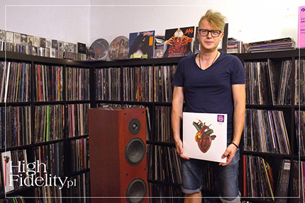
⸜ Zbigniew Bielak in his studio outside Krakow, Poland, with an album Torn Arteries by Carcass Those interested in the topic would probably point to the We Have Flowers for You album by the Blue and Blacks, prepared by the well-known Polish poster artist, WALDEMAR WYWIEŻY, but they also would not forget about our “Western” star, STANISŁAW ZAGÓRSKI, working for Atlantic Records, and later for the American branch of Columbia Records (CBS), who created such iconic covers as ones for Loaded (1970) by THE VELVET UNDERGROUND, the Hair (1968) soundtrack, Young, Gifted And Black (1972) by ARETHA FRANKLIN, and from domestic artists Atma by MICHAL URBANIAK (1974); For more, see Filip Lech's article titled Oceniaj płytę po okładce: przygody fonograficzne polskich artystów → HERE. All of them, to a greater or lesser extent, were associated with the so-called Polish Poster School, described by Culture.pl as follows:
There is a consensus that the term in question is not a definition of any school or trend, but an attempt to “embrace” a certain set of phenomena. As Culture says, “the common denominator is perhaps only the allusiveness mentioned in the introduction, the ability to use any topic to talk about Poland or people in Poland.” Let's add that recently, the Bosz publishing house published the work of Zdzislaw Schubert entitled, simply, Polska Szkoła Plakatu, and reproductions of works by artists associated with it can be purchased at the online store → POLSKASZKOLAPLAKATU.pl. But, paraphrasing the words of Maryla Rodowicz and the author of these words, Andrzej Sikorowski, it's been done before, and, it would seem, it's time for a something new. While the Polish School of Posters is a phrase that nevertheless has a specific designation, nowadays it is difficult to point to any trend, a common idea, or even to distinguished authors of Polish album covers forming a coherent body of work. Maybe apart from the fantastic projects of KUBA KARŁOWSKI, creating for the AC Records label. However, this is a niche. In the 21st century, we are dealing more with pointwise phenomena than trends, successful ‘single shots’ rather than long series. For the sake of example, let's recall two rankings that describe this phenomenon well: from 2021 and the 30/30 Contest, and from 2022's Label magazine, where the covers are extremely stylistically diverse. 
⸜ A cover of Carcass’ Torn Artesis As we read, the top prize in the 30/30 Contest was won at the time by Lukasz Paluch for his cover of Highlight by the Skalpel duo. Second place went to Jacek Walesiak and the cover of JWP/BC's Koledzy album and third place went to Bartlomiej Walczuk and Pawlowo Fabianski for Uśmiech!. In turn, “Label” honored Piotr Pytel and Eleonora Roginska for Family Head by Bialas, a large group of creators consisting of: Bartlomiej Walczuk, Julia Konopka, Jacek Rudzki, Daniel Jaroszek, Justyna Markowska, Magda Jagnicka, Magda Betlejewska, Maciej Wocia, Matilda Materna, and MOON FILMS for the collage on the front of Lata Dwudzieste by Dawid Podsiadlo, as well as Mateusz Król, Kinna Zimmer and Tom Kudlak, responsible for the graphics of Kinna Zimmer's Letnisko album. To be clear - in Poland there are many promising, very good, and even exceptionally interesting graphic designers practicing this profession. This, however, is ‘scattered work’, so to speak. Let the suspension of the very cool blog → OKLADKI.net by Stanislaw Gruszynski, who also disappeared from the radar after moving to → DECYBELEDIZAJN.com, attest to the problems with it. Anyway, the blog itself seems to by in the standby mode rather than active; the only entry from this year is from April. ▌ Zbigniew Bielak AS I SAY, NO NAME, OR GROUP OR STUDIO, has broken through into the public consciousness enough for us to talk about common recognition. Except for one. The man in question, ZBIGNIEW BIELAK, has been building his brand for years and is well on his way to becoming not just a well-known Polish record illustrator also recognized abroad, but simply a well-known illustrator, period. To be blunt, let me say that he is not just ‘on his way’ - he's already part of the mainstream, and his work is so recognizable that when Ozzy Osbourne asked to design a microphone stand for himself, his agency turned to Zbyszek. I have been asking for the conversation you can now read about for many years. Maybe not very actively, but I hoped that sooner or later - it would happen. After all, the protagonist of the text and I have known each other for many years, with ‘audiophile matters’ in the center of our common interests, but we have never had the opportunity to talk about his work. And he is the author of covers for all but the debut studio album of the GHOST, the stage setting for the new tour of this Swedish band has been designed by him, and he has designed covers for the legendary bands such as Carcass, Mayhem, Darkthrone Possessed, Portal and Fog. That is, the best metal, and heavy metal bands. 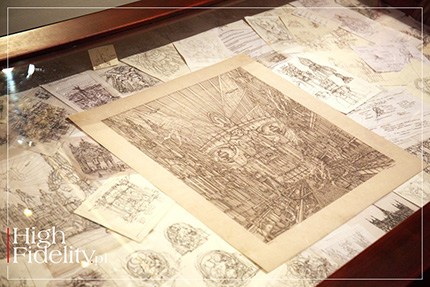
⸜ Zbigniew began his adventure with drawing by hand - in the picture there are some examples of works of this type from the exhibition in Pieskowa Skała He is also a winner of a number of industry competitions, including the “Heavy Music Awards 2019” in London (Ghost, Prequelle) and the “30/30. 2023 Best Record Cover Competition” under the auspices of Radoslaw Szaybo (Ghost, Impera). In the description of the exhibition of his works at Pieskowa Skała Castle, Professor Pawel Frelik writes this about his style:
WOJCIECH PACUŁA talks to ZBIGNIEWEM BIELAK, graphic designer, illustrator, architect by profession, passionate lover of metal, but also an avid audiophile. WOJCIECH PACUŁA Are you an architect because of the home you grew up in or by choice? ZBIGNIEW BIELAK You could say that primarily because of the home I grew up in. My father believed in the profession and in the succession of generations. So he gave me the same name so that there was no need to change stamps, and in addition, he ‘programmed’ me in such a way that I became an architect. I worked with him and ran the office for ten years. But I was relieved to leave this profession, because it became very frustrating when idealism was replaced by bureaucratic gehenna. I think that what really pushed me into architecture - and this is the ‘by choice’ component - was fascination with historical architecture, with its monumentalism, grandeur and so on. It's a record in stone of all the ambitions of mankind at any given time - it’s very permanent. The history of civilization is fascinating, and it's sad when it gets bogged down in official paperwork as it is often the case these days. And I collided with the realities of Poland in the early 2000s, when I graduated from college and started working. And it was a hard cognitive dissonance. The amount of compromises you have to make when designing any building effectively robbed me, but also, as I see it, other peers, of enthusiasm. In addition, it washes out the idealism and imagination, after all - at least in theory - architecture is supposed to serve people, but also - at least in theory - to be an artistic expression of the architect's soul. WP • Did you have any other, your own, passions? ZB • I loved to draw ever since I was a kind, and I can tell you a funny story related to it. My father apparently took my works more seriously than I did, because I had my own exhibition (!) as early as when I was five years old. It took place in June 1985 in the former Dominican Stalls (these are low buildings with arcades, located in the very center of Krakow, on Stolarska Street, in the 1980s a place of frequent exhibitions, but also the location of many pubs - ed.). And since the parents were quite well ‘established’ in the Krakow art community, a lot of famous people came to the opening. One of them was Tadeusz Kantor, who allegedly annoyed me with something so much that I kicked him in the ankle. This story has accompanied me all my life :) 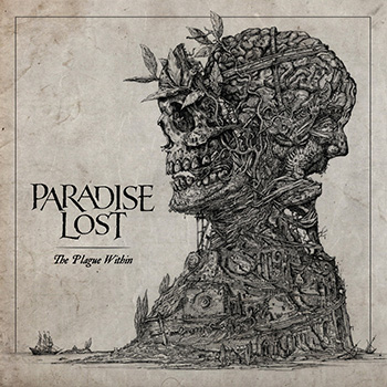
⸜ Paradise Lost’s The Plague Within cover But this event must have traumatized me greatly, because for years it seemed to me that the only thing left of this childhood ‘creativity’ was the boards from this exhibition. As a child, I quickly discovered music and forgot about drawing for many years. It wasn't until years later that I found a folder with several hundred drawings and realized that what I do now didn't come out of nowhere. WP • You’re saying that being an architect in Poland is difficult, but after all, your dad did exceptionally well, didn’t he? ZB • True, father did very well, and that was great, but at some point market realities changed, and his age naturally added on top of it. By the 2000s he was successful, designing award-winning buildings, many things that still function in the Polish landscape today. He designed, for example, the Museum of the Pieniny National Park in Krościenko, tourist service facilities for the Dunajec River rafting trip, the award-winning large School Complex in Skała with a Sports and Entertainment Hall, but also swimming pools, municipal offices and quite a lot of housing buildings, such as the two tenements on Szeroka Street, or the Zabierzów City Hall - we have done these projects together. However, the profession was becoming increasingly difficult in our realities and marked by the instrumental role of the architect in the investment process, which over time caused frustration relegating the artistic dimension of the work to the background, making it far less important. For many, the degradation of the architect's role in the investment process is an unacceptable matter. 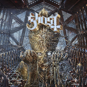
⸜ Ghost’s Impera album cover was chosen as the Best Album Cover 2022 in the 30/30 contest under the auspices of Rosław Szaybo WP • But, as I understand it, the university gave you tools for the job? ZB • Yes, totally. I got great tools. But they were given to someone already shaped, because, after all, I grew up in a house where carbon paper, rapidographs, drawings lay everywhere. I really liked the precision architectural documentation is created with. In addition, my father painted excellent impressionist paintings, so such a mix of inspirations certainly influenced my own professional path. I returned to drawing at the end of high school because I had to prepare for university exams, but a true passion for it returned only after I got in - that's when drawing started to excite me again. It didn't exactly help that while conceptual drawings for student projects at Architecture Faculty were done by hand, in the subsequent - let's call them presentation - phases, the preferred tools were AutoCAD or 3DMax and other at the time somewhat still far-from-perfect software. They became standard in the professional work of every architect. They served the purpose of conveying technical information without an emphasis on artistry, and I personally missed the latter, namely drawing. After all, it was not the computer but hand-drawing that was the architect's main tool for thousands of years. To compensate for this longing, I began working with the Polish Academy of Sciences on the inventory of artifacts from archaeological sites, and then, with several publishing houses in Krakow, one of which prepared textbooks for the Polish American community and the other encyclopedias. Much more interesting was the latter commission. Fogra, an offshoot of the Świat Książki publishing house, was one of the last outlets in Krakow that were still publishing encyclopedia books in large format. They needed someone to draw them close to the originals variations on works of art - precise, small drawings, for multi-volume publications. And this appealed to me very much. WP • Was it a good exercise for you as an artist? - After all, this is a very service-oriented business. ZB • It was a great exercise. The concept was to make the whole setting coherent. So I drew several hundred things - battle scenes, busts, portraits, landscapes or even redrawings of title pages of old prints, etc., being able to practice the style I've always liked. But that ended, around the time Wikipedia plowed the market for substantive encyclopedic publishing. All information was given away to people in the form that didn’t require any effort to use. This changed the structure of the market, and I was left with nothing, just like Himilsbach with English - with a lot of drawing material in a dense, engraved style and a pretty well-trained hand. WP • How, then, did you make the jump from encyclopedia to music? ZB • This, in turn happened due to my other passion, which is metal music. I was a ‘metal-head’, a music lover and a collector of pop culture artifacts. Exchanging vinyls with other aficionados throughout the years, I had various contacts, including in bands. At some point I showed my drawings to Erik Danielsson of the Swedish band WATAIN, which at the time was very popular in the world of heavy metal, even iconic and, to top it off, a bit ‘dangerous’, which turned me on as a 20-year-old. The historicizing style inspired by the works of Gustave Dore or Albrecht Durer was a holy grail of black metal aesthetics - excerpts from old engravings often appeared on albums or in zines, so the encyclopedia drawings really appealed to him, and we agreed to try to prepare together graphic artwork for their next, fourth album, entitled Lawless Darkness (2010). 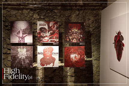
⸜ Part of the exhibition in Pieskowa Skała This was the moment when the band was already coming out of the total underground and was becoming more and more visible in the metal scene. This move proved to be a hit. At that time, that is, at the beginning of the second decade of the 2000s, the photoshop aesthetic, which had ruled in music since the beginning of the 21st century, had become too much for many people, as there were almost no covers that were well-draw. My advantage was the fact that I presented analog material, refined almost manically. It was different, polished, each track was given its own illustration, something that was not done at the time. This is how the second part of my adventure with music began. I was also still working as an architect, and only abandoned this activity somewhere around 2015, when my artistic career was by then well enough established that I could afford it. And the comfort of smuggling architectural themes into my covers that really coincide with my idealistic idea of what architecture should be was extremely important to me. I also knew that I was in good company, as there were more ‘architectural deserters’, such as Escher, Lebbeus Woods and Giger (Maurits Cornelis Escher - Dutch painter and graphic artist known for his love of mathematics, Lebbeus Woods - American graphic artist known for his unconventional and experimental designs, H.R. Giger - painter, architect, creator of installations, furniture, best known for designing the Alien character in the 1979 Ridley Scott film - ed.). WP • How were your musical fascinations received by your parents? - It somehow doesn't quite agree to me with Kantor and the so-called ‘Krakow society’ :) ZB • Depends (long laugh...). Generally - they suffered, because they couldn’t understand this fascination of mine. When my parents moved near Krakow in the late 70s and early 80s, I regularly went with my father to the city, to his office. Of course, as a young fan, during the drive home, often with hands trembling with excitement I would play in the car the pirate cassettes I had bought, introducing my parents in a hard way to the so-called beauty of metal. I remember their horror when they heard the music of the Brazilian band SARCÓFAGO from their album Rotting (1989), as well as their comment: “These are nothing but some screams of an alcoholic in delirium!”. Today I understand them a little better. Nevertheless, the musical virtuosity and the layer of peculiar beauty that is evident in this music, although to the layman buried under the male roar, did not convince my parents for a very long time. Also, the love of music overshadowed for a long time other, including creative, interests in which I did not do too badly as a child. This, too, may have bothered my parents, as I did not return to drawing for a long time. Around the time I took up studies at the Faculty of Architecture at PK, I was primarily a young consumer of culture - watching movies, reading books, collecting records, digging through the underground in search of interesting demo recordings. Until then, however, I wasn't giving anything back creatively. Later, when I found a magical way to combine music, drawing and architecture, my parents understood my bizarre world a little better. Also connected with the appearance of music in my life is, ironically, my parents' acquaintance with a priest who, having returned from France, took over the parish in the neighbourhood. A very educated, interesting man, a clergyman who graduated from Sorbonne, and in addition a painter and music lover. Due to the poverty of social contacts after moving to the countryside, we often attended parties with my parents at his rectory. And while the elders were discussing the fate of the culture and the nation over a glass of some liquor, I would bushwhack through the library, flipping through old editions of Larousse's Encyclopedia, full of detailed, filigree illustrations. It was also where I first saw CDs and, most importantly, my first ever catalogs of audio equipment. The audiophile seed must have come from there. WP • Well, that's right - we met on a different audiophile ground - metal music and being an audiophile? Isn't that mutually exclusive? ZB • Absolutely not - this is something that has enriched my musical world immensely and allowed me to experience the ‘works’ with due respect, and this, in my opinion, is very important. Immersion is a measure of experience. Anyway, this is a good time to say that you, Wojciech Pacula, played quite a big role in all this yourself. I remember that you used to get ‘demos’ from various metal labels, and I used to write their reviews for you. It was a very long time ago, I don't know if anything has survived from that time, but it was a moment when I, as a man who was shy by nature at the time, felt that I could somehow go out to the world, to people. And so it began - for the first time I had the opportunity to actively participate in the world of music. 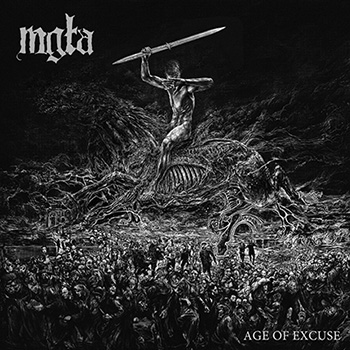
⸜ Mgła’s Age Of Excuse cover WP • It is very difficult to record metal music properly, but equally difficult to reproduce it well, right? ZB • This is somewhat true, but I have the impression that the ’audiophile ethos’ has changed over time. A completely different sound was considered to be top-notch in the 1970s, that is, in the ‘golden age’ of vinyl, and a different one today. But retro is making a comeback, and there is also a place for it, or rather some reinterpretation of it, in the current audio scene. Although it's not that simple. When you listen to music from the 70s or 80s from an LP, the difference in sound quality compared to mass-produced vinyl today is gigantic, in favor of the original. This was the time of analog and the equipment played very differently. Also different was the know-how of the people who worked at pressing plants. The collapse of the publishing market in the early 1990s, when vinyl gave way to CD, and pressing plants massively laid off workers who had spent their whole lives making vinyls, was, in my opinion, a big blow to the quality of black discs hitting the market. You can hear this vividly by comparing the sound of records pressed up to 1995 with later editions. The difference in favor of the old editions is huge. |
Getting back to the point - I don’t like modern audiophile sound with its sterility. This is a sound that is suitable for casual listening on the couch, after work, when you are tired and you are supposed to come out of such a session relaxed. And quiet and rather ‘audiophile’ music sounds best on such equipment. In my opinion, this is like turning things on their head. I have the impression that equipment today is designed to play well only well-recorded stuff, and also the well-recorded stuff has a ‘lounge’ characteristics. What I miss there is the nerve, power, energy, slam, and therefore raw emotion, which doesn't need to be separated analytically into components to appreciate nuance. Sure, I can recognize and appreciate the outstanding sound of modern, often exorbitantly expensive systems. Nevertheless, I get the impression that exceptions to the rule are now rare, and I still remember, for example, the sound of Ancient Audio's extraordinary Little Wing speakers from my first visit to the Audio Show. A dozen years later, when I visited the Sobieski Hotel again in 2022, the lively, expressive sound of Jarek Waszczyszyn's system again appealed to me the most. And yes, it's true, objectively most metal albums are not the best recorded ones, but after all, the whole fun is to configure the setup yourself in a way that will forgive recording/production shortcomings and allow you to simply enjoy the music. Somehow I find it hard to believe that all people involved in recording rock music are either deaf or dumb. It seems to me that many things that audiophiles today perceive as sonic abuses are intentional choices. It doesn't matter if we're talking about metal, jazz or classical music, sometimes music just HAS to sound that way - thrilling, expressive, bold. Metal or rock that sounds great in the studio, at a concert, should also sound that way at home. The sound starts in the imagination, and problems arise when we try to reproduce it at home. I remember many such disappointments in my life. Audiophile paths are more often winding than steep. ⸜ System 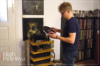
⸜ Zbyszek and his SME 20; he uses RCM Audio Sensor Prelude IC Mk II phono stage ZBYSZEK’S SYSTEM is completely and absolutely different from 99% of the audiophile systems I know. However, it definitely belongs to this world, but in its own rights. You will read about its assessment below, now let's just say that it consists of an SME 20 turntable with a Dynavector Karat 23RS cartridge, a split amplifier from Naim, Entreq cabling and Danish Physics Point Zero 2 speakers. The artist's Krakow studio, as there is also a Warsaw studio, is located on the first floor of the family home, which is a manor house restored by his parents near Krakow. Entering it, one also enters tradition on one side and a metal sanctuary on the other, with a large drafting table, walls lined with vinyl records, and there is an audio system too. 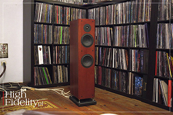
⸜ Danish Physics Point Zero 2 loudspeakers The sound of Zbyszek's system is unbelievably dynamic and open. If it played anything else I would say it was bright. But playing Metallica's Kill'em All from the first pressing, Roots, my favorite Sepultura album, or other crazes from Type O Negative to Samael, that is, very heavy and very dark recordings, I could almost see the choices the host had made. And the idea was that the attack should be immediate, that the selectivity should be delectable, and that nothing should be lost or ‘gurgle’ under the surface. As Zbyszek said, it came to a point where, despite the sophistication of the components in the system, he left an ordinary extension cord from Castorama, because the audiophile power strips smoothed the sound too much, depriving it of color and energy. 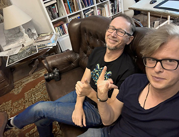
⸜ Zbyszek (on the right) and yours truly on the couch Put together like this, the system delivers the music in a very powerful way. In an incredibly open way - in a largely a-audiophile way, so to speak. For it is not that this is an anti-audiophile sound. As you are about to see, the author of the covers for Vader and Paradise Lost albums has gone the full ‘audiophile's way’, from the Samsung mini-tower to the repeated replacement of individual components, with moments of failure, but also revelations. This is how the listening system of anyone who wants to enjoy their own sound, not a sound borrowed from audio shows, from friends' systems or from magazines - should be built. WP WP • When did you consciously start looking for ‘your’ sound? ZB • My conscious audiophile path began with Tomek, host of the Krakow Sonic Society meetings, and privately a good friend of mine since high school. We were united by our passion for metal, and it was with Tomek that I first went after school to the Zena Studio store in Krakow's Kazimierz district. I had already started collecting vinyls by then, and as it was necessary to play it back somehow. At first I borrowed Unitras and other Adams from my parents' friends, but this did not yield the results I required or perhaps what I imagined. But it was at Zena Studio, in the second year of high school, that I bought my first ‘real’ turntable, a THORENS TD180 with an Ortofon Om10 cartridge, and on it I listened to music for a couple of years. But even with ONKYO electronics, some speakers in a double D'Apollito array, I can't remember the name (Fonus?), it didn't play very nice. But I was also at that time more of a collector of artifacts, i.e. records, cassettes, etc., so it didn't particularly hurt me. Tom at the time bought himself an ARCAM and we tried listening to Immortal’s vinyls, etc. at his place, and although it played better than at my place, it still wasn't something I was looking for. So I started experimenting. The Thorens broke down, so I bought a basic MICROSEIKI model - this time with SHURE's M95 cartridge, and later the legendary V15. Then the vinyl started to play in an acceptable way. On the other hand, one of my friends was an ardent advocate of Ukrainian amplifiers called OMAK, and due to his influence I first bought myself a Jewel One integrated amplifier and then Jewel Three monoblocks. I remembered them from Zena, and the equipment looked a bit like a Minsk III refrigerator, if you remember such a thing. This is probably what a tape recorder looks like in a tank. The sound also had shortcomings - it was not very controlled, but finally it was a magmatic, colorful and most importantly - powerful sound. I liked it very much and used these amps for several years. However, due to the lack of a dedicated preamp, and the consequent need to experiment with various strange, somewhat clumsy volume control configurations, or problems with the perpetually burning out and shocking me at adjustment Soviet triodes from the MiGs, I finally decided to look for something else. 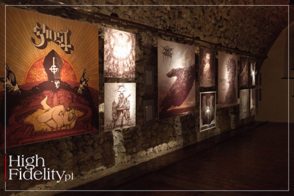
⸜ A part of the exhibition at Pieskowa Skała, the Ghost in the forefront I think it was 2005 when Tomek and I went to Warsaw for the Audio Show, on the occasion of which I bought second-hand PRIMARE equipment, a CD31 player and some kind of their integrated amplifier, probably an I30. I stayed with that system for a long time. But I missed the power I had with the Omak, so I bought a KRELL KAV250 power amplifier, and used the Primare integrated as a preamplifier. And Krell, being Krell - sounded very differently, way colder than tube monoblocks. Additionally, that blue LED... psycho-acoustics at full wave. And that was the moment I met you - the Eichmann cables from you corrected that sound a bit and in this way I had a relatively set ‘sound base’. But I still didn't have a real turntable. So I bought a turntable, which I miss to this day, because I later sold it - ROKSAN XERXES. Monstrously difficult to set up, almost a musical instrument that had to be tuned regularly, but it offered a sensational sound - the difference was gigantic. Pretty soon I bought an SME IV arm for it and that was something! At that time I wanted to enter the world of MC and for a while I had a Denon DL-103R cartridge, but somewhere around 2009 I decided I had to have SME deck. At that time I bought an SME 20 turntable, an icon of audiophile vinyl. But as it turned out, I didn't think it through. You can say that the turntable was too much for me, because when I installed everything myself I almost wept for the Roksan. The SME is an absolutely transparent, raw machine, and it seemed to me that all the juice of the music had evaporated somewhere. Today I know that it was the Xerxes and the fleeting homeostasis of its wooden chassis, tuned like a violin, that allowed the Denon to shine, even though it happened by mistake. Well, knowing that the SME turntable is a top-of-the-line device, I started looking for the problem in my system. At the time, the world of vinyl with its micro-physical conditions fascinated me greatly. I read the entire Internet and discovered that the DL-103R cartridge did not fit the SME V arm, and consequently did not fit the SME IV either :) ‘Fixing’ a new turntable, I thus began to look for a compatible cartridge and that's how I met, for example, Julek Soja, who now runs Soyaton. At the time, he had a wonderful VPI turntable and a collection of cartridges that, courtesy of him, I was able to test in my system, including the Clearaudio Discovery. And it was from him that I borrowed the Dynavector Karat 23RS cartridge, a vintage, novelty classic with a short ruby cantilever, which I still most enjoy playing today. Thus, everything suddenly ‘jumped’ into place, the SME came to life, and I finally found my sound in the dynamic character and colorful, expressive midrange of the Dynavector. I became a fan of this brand and a collector of their cartridges. The Karat 23RS, despite its mature metric, still stands worthy against other cartridges, often many times more expensive. And the copy we're listening to is, as far as I remember, already my third, and one recently re-tipped by Peter Lederman at Soundsmith. There's a funny story related to this, too. When I shipped the cartridge to the States, the package came back with a note that customs refused to let the shipment pass because the law prohibits sending ammunition, and after all, 'cartridge' in English is also used for 'ammunition' :) In the meantime, a wonderful RCM Sensor Prelude IC phono preamplifier was added to the system, which took communing with vinyl to a whole new level. WP • You didn't mention the speakers you have, made by DANISH PHYSICS. ZB • Indeed - these are my beloved speakers, the Point Zero 2 model. This is not a typical choice, but it turned out to be something I was looking for. There were periods when I stopped taking an active interest in audio and concentrated on music and work, so the any upgrades were on hold for the time being. And such speakers were in possession of the, already mentioned, Tomek, and it was at his place that I first listened to them, somewhere around 2000. And they played wonderfully. I fell in love with their sound. Thanks to the paper-carbon drivers and the textile dome, they played with an engaging, powerful, maybe even a bit flamboyant sound, but they were also extremely colorful and energetic. Although they are two-and-a-half-way, small designs, they really love power and powerfully driven they play vibrantly and boldly. And that's what I damn well liked about them. Nothing has changed in this regard, I've had them in my system for almost twenty years. The day I bought them was one of the happiest audiophile days of my life. The next, and last huge upgrade to my setup was adding to it NAIM electronics, which I think I will stay with, because it was thanks to the “green apple” that I finally found my sound. 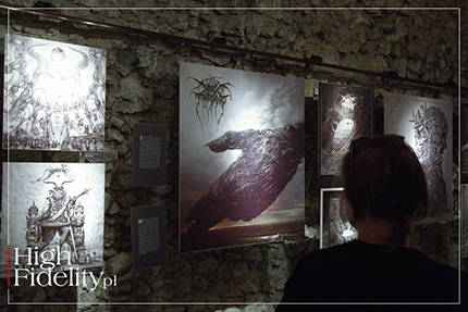
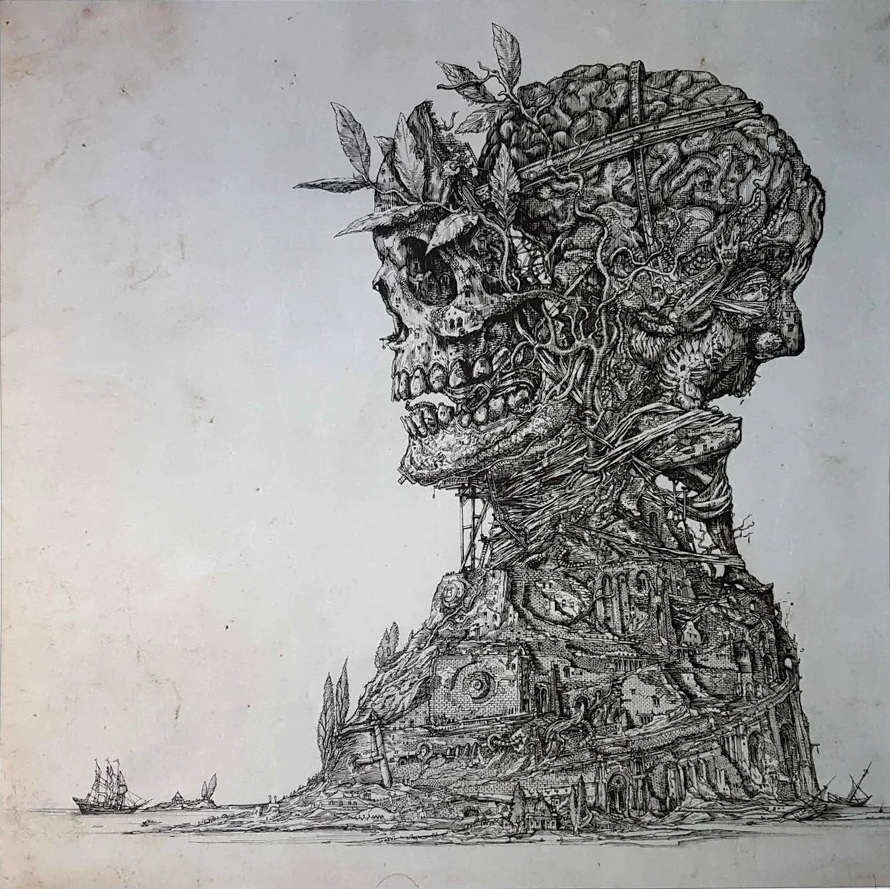
WP • Do you draw when listening to music? ZB • Sometimes I do. Of course, it's good to listen while sitting comfortably, but my attitude to music has me engaged in what I'm listening to. That's why I often leave the table, sit on the couch, and that doesn't affect my productivity in a good way :) But there is no other way - vinyl is an engaging medium. But such moments of breathing, relaxing - they are also moments of inspiration for me. WP • When you design something to order, for a specific project, do you have the music of that band in your head? ZB • The impuls comes from different sides. In the case of Ghost, where we have very convergent ideas about what aesthetic regions we want to move in, the ideas often come from Tobias Forge (group leader - ed.), and I work through them and there are rather no complaints :) Looking at my other covers, I have to say that situations where I had to bend my ideas are very rare. At a certain stage I started to get enough trust from the musicians and the label that no one told me how something should look, and I also had confidence in myself. But sometimes strange situations happen. I know you're fond of PARADISE LOST, and it's with this band that one of them is connected. I prepared a cover for their album The Plague Within (2015) with a multi-threaded ‘bust’. It's a shape reminiscent of a king, who is looking with a dreamy gaze - which you don't see in the end, but I’ll get back to that in a moment - at his declining kingdom. And Sisyphus tries to shove his brain into his skull. I remember that at the end of the work, when everything was drawn, I sent it to Greg McIntosh (the band's guitarist - ed.) for review. And an email came in which he wrote that he didn't like anything about it, and that he associated the drawing with Terry Gilliam and the opening credits of Monty Python's Flying Circus. Despite the fact that everything had been previously agreed upon and played out, now he didn't like either the face or the Sisyphus, on top of which he also suggested that there should be a skull instead of a face. I was very annoyed, because the work was supposedly finished, and it turned out it wasn’t at all. The redesign was difficult, because it was necessary to either stitch, or scratch, large areas of the drawing. For a moment I wanted to end the cooperation. I was very uppish at the time, after all, I was working with huge underground bands, and that set me against such compromises. However, the label convinced me to try to finish it. 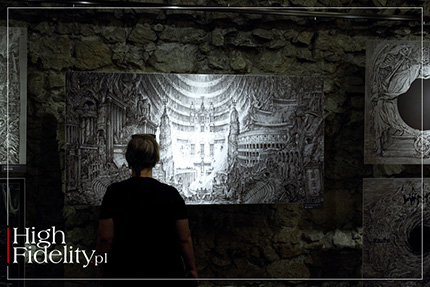
In the end, it worked out for everyone. I swallowed my pride, transformed my face into the skull you see on the cover, and it really worked. The cover is to this day considered one of my best works. I also liked it myself. It taught me a certain humility. Maybe not so much to always punitively listen to the client instead of creative instinct, but rather to be more ‘vigilant’ in revising my own ideas. Because there is such a thing as a ‘fatigue’ of work. You do something for a long time, you keep staring at it, and subconsciously you get a little tired of it. You have to finish the work, and there is not enough time to catch your distance. It is then worthwhile to clash with the opinion of others. WP • These “big” covers like for Paradise Lost, or Ghost opened some new doors for you, or just widened what you already had? ZB • It's hard to say... But it probably did - for once in that non-metal and even non-music clients started to come to me. Thanks to these contacts, for example, I designed a card for Magic: The Gathering (the most popular and largest card game in the world - ed.). Another time I was contacted, completely unexpectedly, by Bea Åkerlund, a fashion designer who works with various celebrities, including Madonna, who asked me to prepare stage settings for OZZY OSBOURNE's tour. That was 2018. I designed for him a richly carved, monstrance-like microphone stand with demonic elements, and my friend Tom Strzałkowski took care of the 3D modeling. Unfortunately, we are all still waiting for health to allow Ozzy to take the stage again. I think this is the most important client I've ever worked with. Giger once made a tripod for the KORN band, but I think mine is cooler :) WP • And what the story behind your work for MGŁA? ZB • It’s simple - Mikołaj and I have been friends for years, and we got to know each other through another friend of mine, Łukasz Orbitowski, a Krakow writer I have known since before high school. Once, at a party at Łukasz house, M. asked if I would do a cover for them. And since I like both Mikołaj and his band, I agreed with the utmost pleasure - it was the Age Of Excuse album of 2019. WP • Looking back on your career in hindsight, do you see the changes in your drawing? ZB • I keep learning to draw, doing it better and better. And I say this without false modesty, it's just about proficiency. The changes also follow a change in the techniques I use. My taste is also changing. The first things, such as Watain, were works that somewhat imitated Gustave Doré, done on thick tracing paper, scratched out with a razor blade to mimic the ritualistic effects. Working with Ghost, which changes historical styles from album to album, forced me to practice a different, more capacious style. But it was still a similar technique. The better I got at it, the more ambitious I became about it in the sense that I tried to make what I was doing even more detailed, even more refined. As a result of the fact that in our latitude the paper has to fit in A or B format iterations, if you want to work in a square, at best you have a side of 70 cm wide. It is very difficult to find a larger paper. So I ran out of space and then I started drawing on a tablet. Stylistically I did exactly the same as before, but this time already without the constraints of the format. 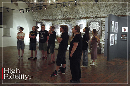
⸜ Participants in a curatorial tour of the exhibition in Pieskowa Skała But here, too, I reached a point where I got tired of it, and where I decided that there was no point in “cramming” the detail any more. In reproduction it simply gets lost. So there is no point in doing even more detailed work. Then I started to do slightly different things. Fog was such an example of a more expressive, turpist aesthetic, with a hint of Larry Carroll and his covers for Slayer. Carcass also happened, which was something else - a physical sculpture of a heart made of vegetables then exposed to natural decay and photographed over many weeks. This is one of my favorite works. WP • Are you often compared to Zdzisław Beksiński? ZB • Yes, they quite often do. I think that this is due to the poverty of references. Dark art in Poland will always be associated with Beksinski, who dominates the common imaginarium. The same is true of Giger, who everyone associates with darkness. Both did similar things in the early stages of their creative careers, similar topoi and compositions run through their work, which connects them to other artists on the ‘dark side’. It's a pretty universal aesthetic, a set of associations, each of us is supposedly born with. Then, as your body grows you are haunted by nightmares, absolutely similar. I used to dream of landfills, and I was eight years old, which were composed of hulking, shiny forms, but with no room for humans, something between airplanes and whales. When I saw Giger works, I saw that he was painting exactly what I had dreamed. Almost identically the same thing. There were such things in Beksinski, too. WP • It's very Jungian, isn't it? ZB • Exactly – Jung rules, and I am his big fan. WP • You said you're now making large 3D molds for Ghost - is that something you'd like to do in the future? ZB • Yes, this is the second time I have prepared a full-scale set design for the band's tours. It's different from drawing, because we're talking about several meters high architectural elements that make the stage into something like a cathedral, but it's still the same language and the same aesthetics close to me. Just like the architecture for games, which I've done a lot of recently. This is where my practice as an architect comes in handy again. It's really easy and fun for me. It's a form language that feels natural to me. I dream of having enough free time to do any of the complex illustrations, such as the ones I did for Ghost, in the form of three-dimensional spaces and print it in 3D. 3D printing is also something I haven't tried yet, and I really like it. I think I will try to incorporate it into my business. And it is, after all, something else again. The first ‘trip’ is when you draw something and someone releases it on vinyl - you think to yourself then: ‘Wow, My life’s great!’. Then you try to make something else, a heart made of vegetables, a tripod for concerts - something that at first seems technically impossible to do, out of your comfort zone and that you have to learn, and if you put enough heart and work into it - it succeeds again. That's the joy of creative work, also sometimes called development. WP • Do you also draw just for yourself, or don't you have time for that? ZB • I don't have time, but in my professional work I have a platform for doing things for myself. After all, when doing a cover for someone I also do it for myself, I am its first recipient. I don't take orders for things that don't interest me musically. But if I like something, I try to do it as well as possible, first of all for myself, after all, I will have to live with such a record. 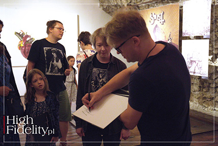
⸜ And some more autographs in the exhibition catalog However, if I am to be honest, recently I have actually started doing some work - for the time being - just for myself. These are experiments I see potential in. For example, last Christmas I bought myself a giant set of alcohol pens, which are made for painting manga. It didn't work for me at all, nothing interesting happened. Until I started using them against the instructions, because on chalk paper, which has a lower absorbency. Then amazing things started to come out, like watercolor effects, forms and colors out of control, but so satisfying that I'll definitely be doing something in that direction. I'm hoping to fulfill all my commitments this year and next year I'll be doing something just for me :) WP • Thank you Zbyszek for the ride and the conversation - will we see you in October in Warsaw? ZB • I, too, want to thank you, and - yes, I WOULD LIKE TO INVITE ALL to the meeting that Wojtek and I prepared on the occasion of the 20th anniversary of “High Fidelity”. I will bring my favorite metal records to the Audio Video Show 2024, and I want you to come listen to them with me! ● ▌ Bio ZBIGNIEW M. BIELAK (born1980, Krakow) – an architect, illustrator, artist. One of the world's best known Polish designers of music album covers, especially for rock and metal music. Creator of album covers for legendary bands - such as Carcass, Darkthrone, Mayhem and Paradise Lost or the metal project Ice-T, and also for Polish bands, such as Georgia, Misty and Vader. Author of concert sets for Ozzy Osbourne and the band Ghost. ● |
main page | archive | contact | kts
© 2009 HighFidelity, design by PikselStudio,
projektowanie stron www: Indecity


